
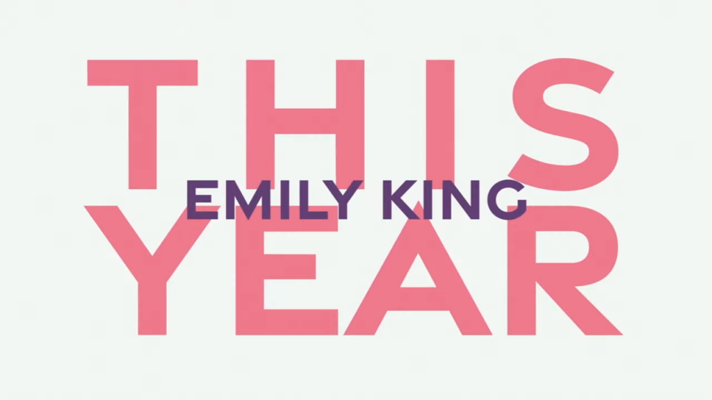
When it comes to creating a high quality and professional lyric video, one of the most important elements to consider is the font. The font you choose can play a significant role in the overall visual appeal of the video and can either enhance or detract from the message you are trying to convey.
First and foremost, the font you choose should be easy to read. If the font is difficult to read, it can make it difficult for the viewer to follow along with the lyrics and can even be distracting. It’s important to choose a font that is clear and legible, so that the lyrics are the main focus of the video.

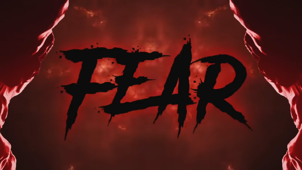
In addition to being easy to read, the font should also be appropriate for the type of music and the tone of the lyrics. For example, a more formal and traditional font may be better suited for classical music, while a more modern and playful font may be better for pop or hip hop. The font should complement the overall aesthetic of the video and enhance the message of the lyrics.
Another important factor to consider when choosing a font is the size. The size of the font should be large enough to be easily seen on screen, but not so large that it dominates the video. It’s important to strike a balance and find a font size that is just right for the video.
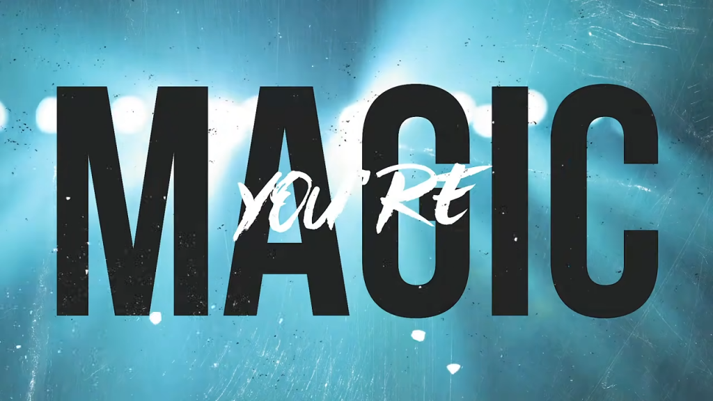
Finally, the font should also be consistent throughout the video. Using multiple fonts in a single video can be confusing and distracting for the viewer. Instead, choose one or two fonts and stick with them throughout the video to create a cohesive and polished look.

In conclusion, choosing the right font for a lyric video is crucial for creating a high quality and professional video. The font should be easy to read, appropriate for the music and lyrics, the right size, and consistent throughout the video. By carefully selecting the font, you can create a visually appealing and effective lyric video that effectively conveys the message of the lyrics.